HEALTH MASTER FOOD STORE
CLIENT:
Health Master food store, New York.
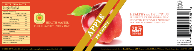
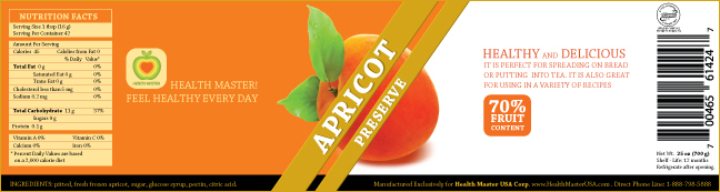
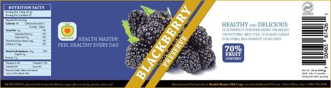
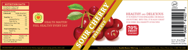
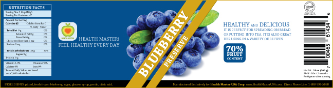
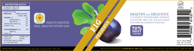
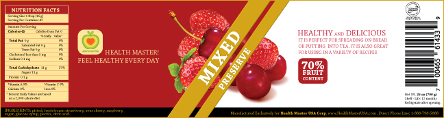
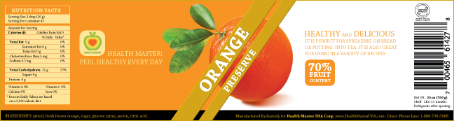
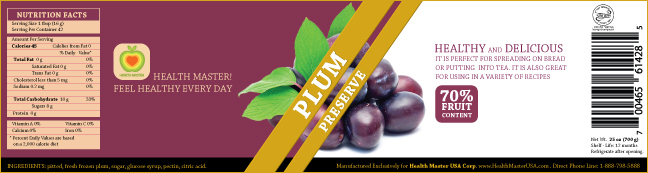
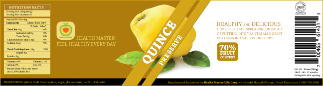
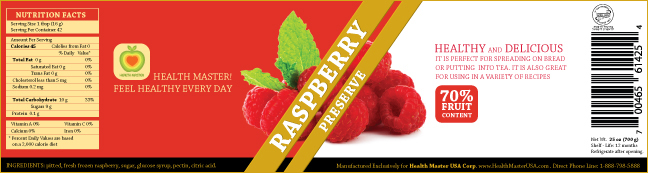
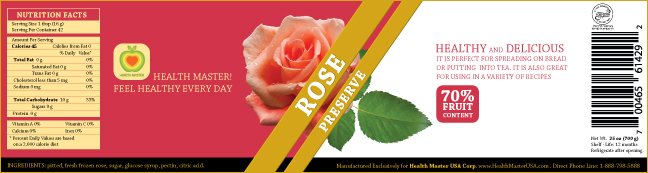
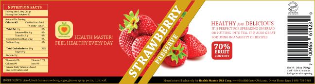
The client is a food store with jams and preserves as the main specialties; his fruit preserves have 70% fruit content. The store’s owner stresses healthy food choices and proper care to preserve maximum vitamins, minerals and nutrition during their prolonged storage. His slogan is “Feel healthy every day!”
TASK:
Create a branding system and labels for preserves.
APPROACH:
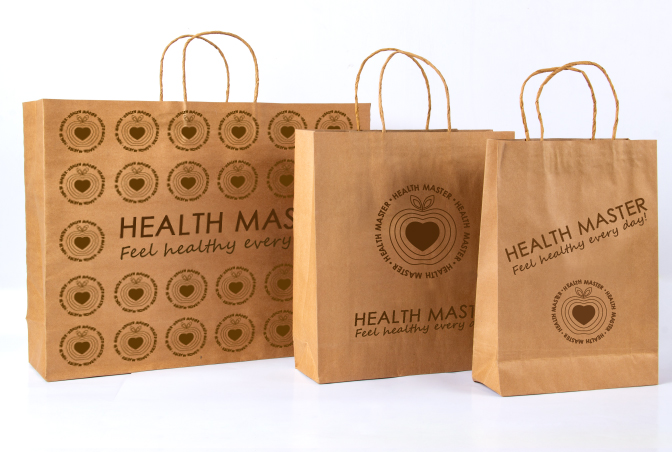
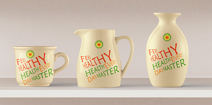
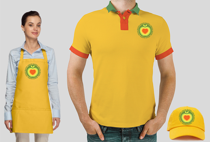
The strategy was to express the company philosophy in the logo, which contain two major health symbols, apple and heart; apple is also one of the preserves components. The logo and slogan contribute to strong brand recognition with a cohesive visual system. This system is included in various implementations: store glass window, store employees clothing, paper bags, ceramics jars, labels and animation.
The company’s mood is environmentally healthy and inviting.
Key colors: green, orange, red, yellow.
Secondary colors: the colors of preserved fruits.
Corporate typefaces: Helvetica, Century Gothic, Chaparral Pro, Segoe Script.
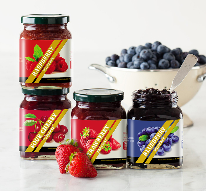


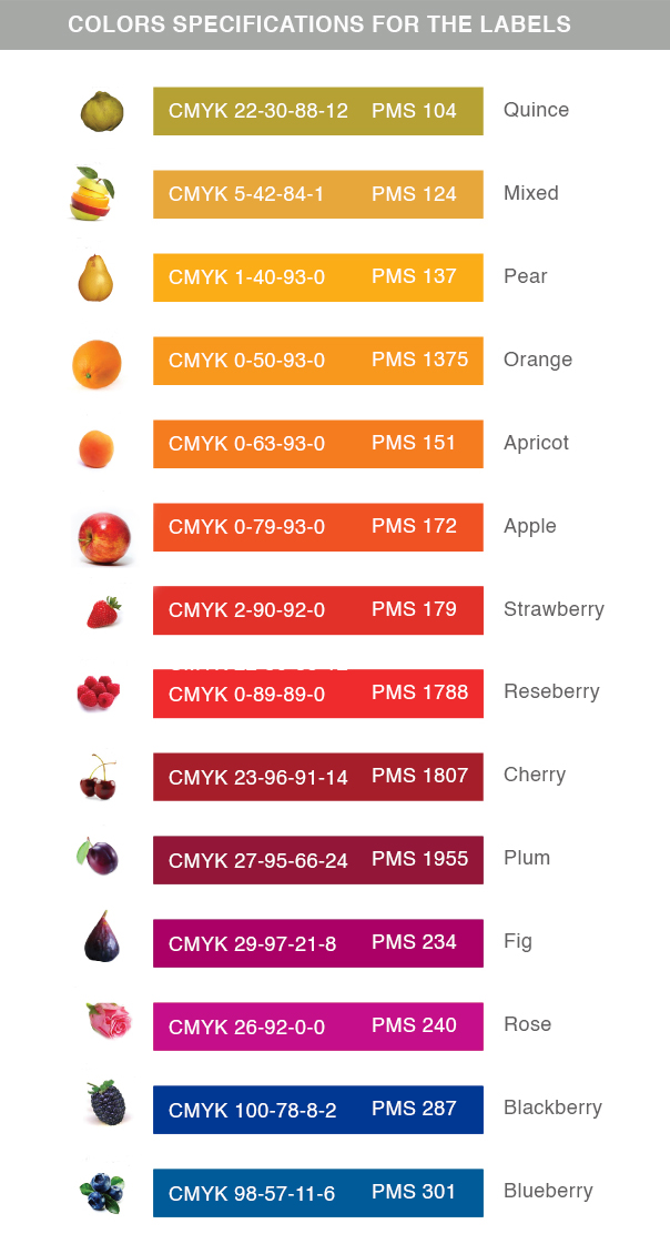
Labels for preserve varieties